
Typography is more than just selecting fonts and sizes; it is a deliberate orchestration of visual elements designed to guide readers smoothly through content. The rhythm of typography plays a central role in readability, subtly influencing how information is absorbed, understood, and retained. This concept, known as typography rhythm engineering, focuses on creating consistent patterns in text that optimize the flow of reading while reducing cognitive strain. By aligning text structures, spacing, and visual cues, designers can transform written material into a seamless reading experience.
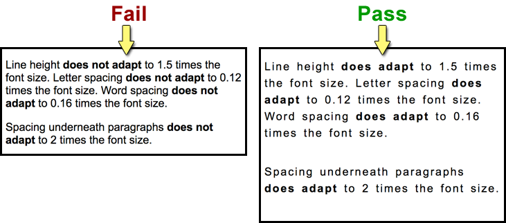
One of the foundational principles of typographic rhythm is consistency in spacing. Line height, also referred to as leading, directly impacts how easily a reader can move from one line to the next. If lines are too close together, the text feels cramped, increasing the likelihood of skipped words or lines. Conversely, overly spaced lines can fragment the reading experience, forcing the eye to travel more than necessary and breaking the natural cadence of reading. Establishing a consistent line height relative to font size ensures a harmonious vertical rhythm, allowing readers to engage with the text comfortably. This relationship, often expressed as a ratio, can vary depending on the medium—digital screens may require slightly more spacing to account for resolution differences, whereas print materials benefit from tighter leading that complements the paper’s texture.
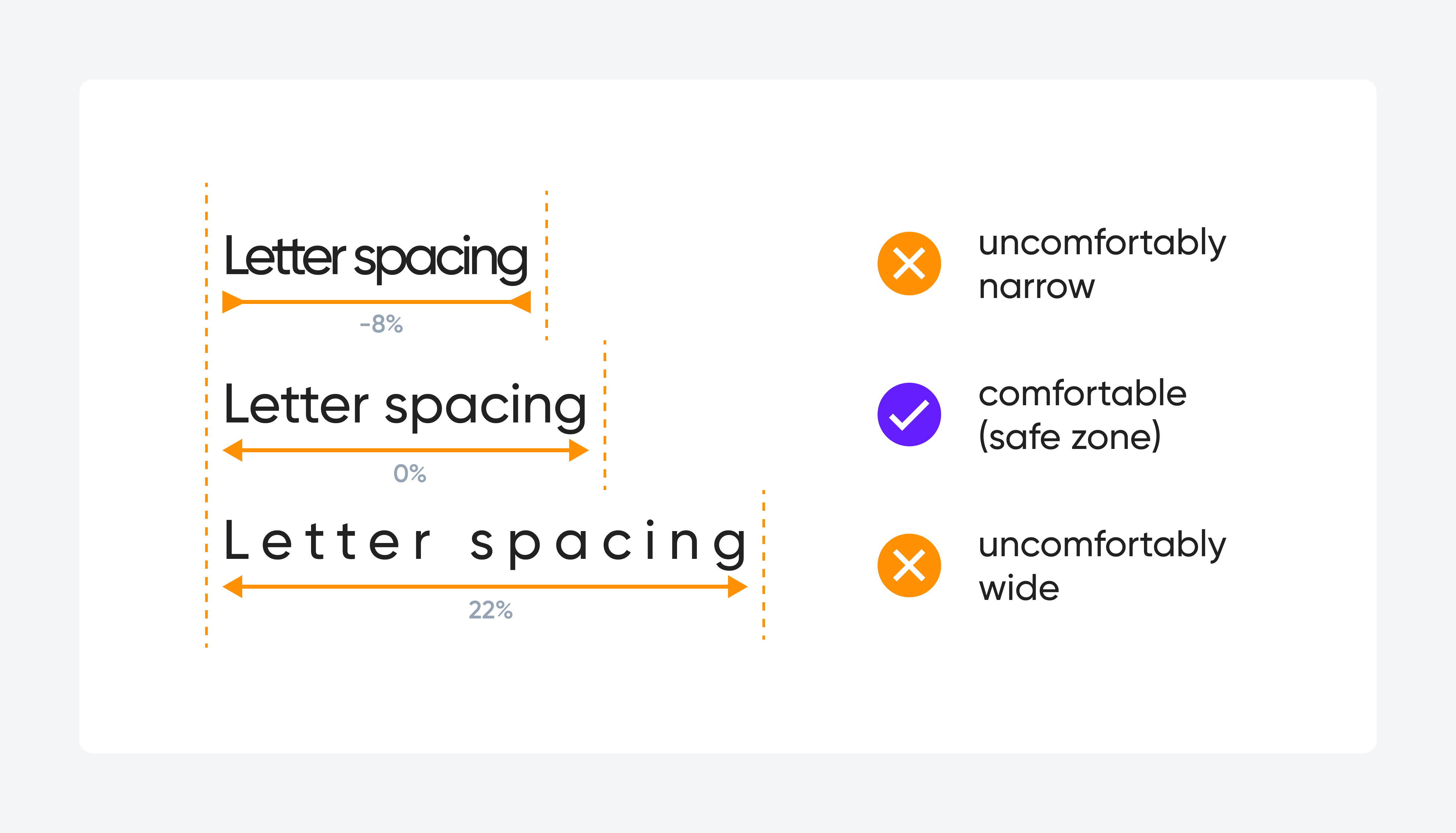
Equally crucial is letter spacing, or tracking, which governs the horizontal rhythm of text. Uniform tracking promotes visual stability, enabling readers to recognize word shapes more easily and maintain reading speed. Irregular spacing, especially in body text, can disrupt the natural pattern of eye movements, causing fatigue and reducing comprehension. In headings and display text, slight adjustments to tracking can enhance emphasis and visual hierarchy without compromising readability. Kerning, the adjustment of spacing between specific letter pairs, fine-tunes this horizontal rhythm, ensuring that letters form balanced and predictable patterns. Effective kerning prevents awkward gaps or collisions that distract the reader and maintains a visual cadence that mirrors the natural flow of language.
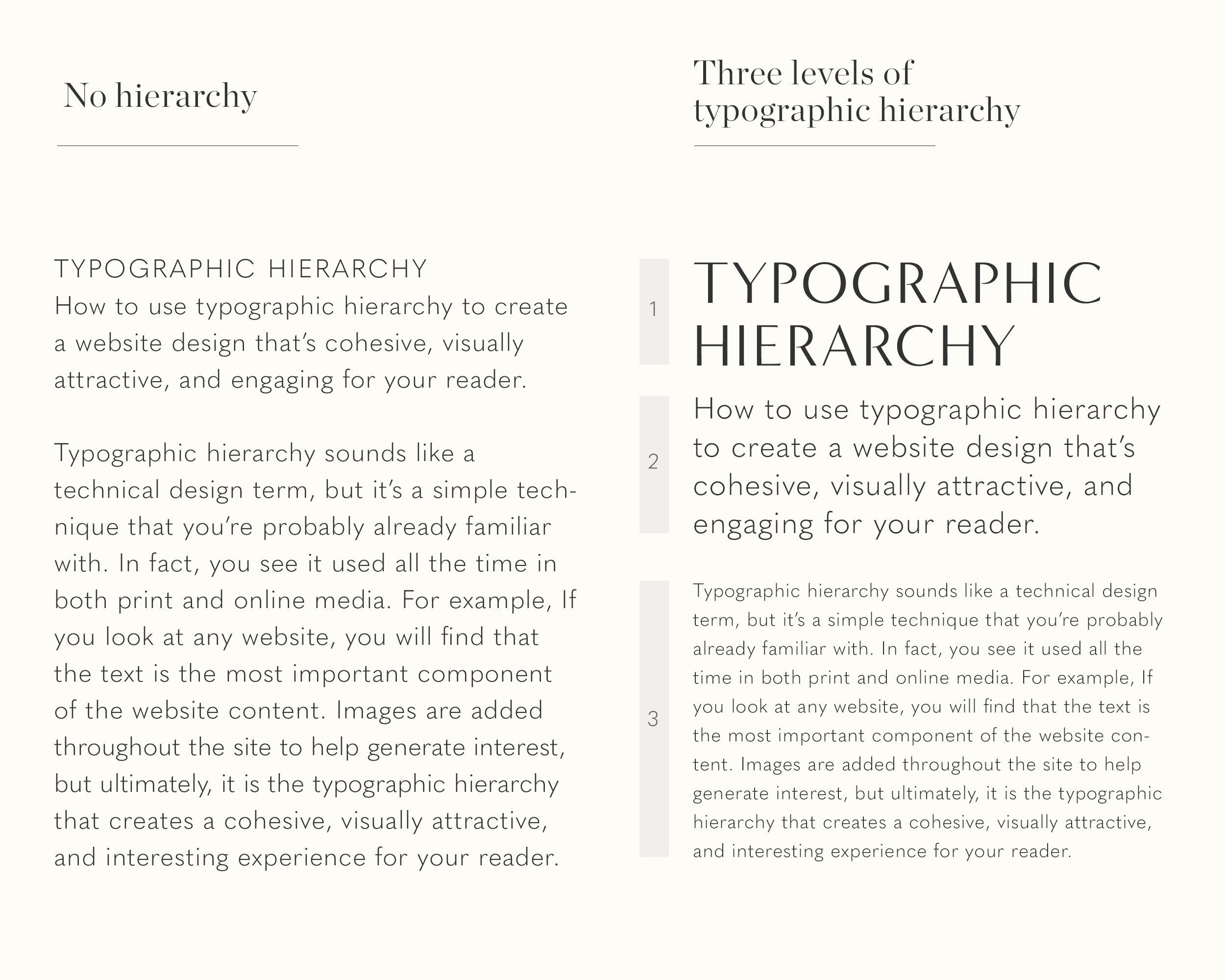
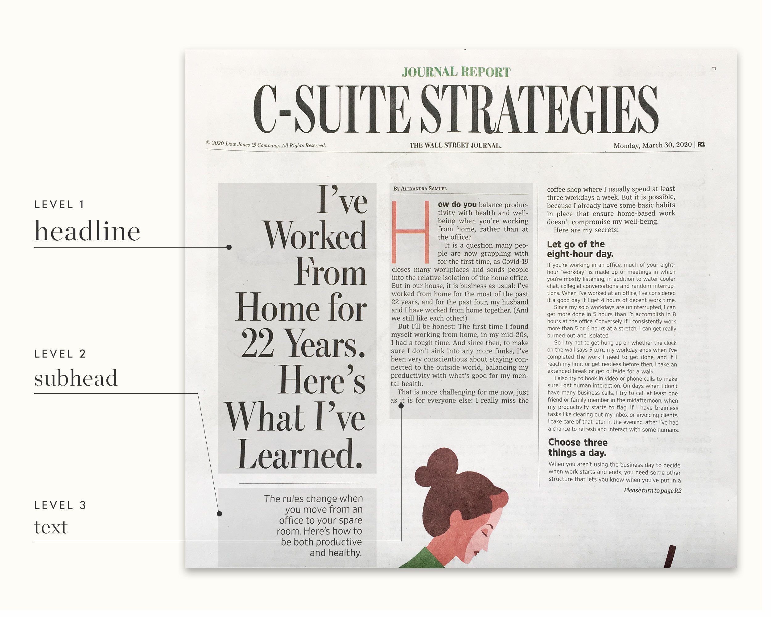
Font choice also significantly impacts typographic rhythm. Serif fonts, with their subtle strokes and terminals, often guide the eye along lines of text, creating a natural progression that enhances legibility in longer passages. Sans-serif fonts, known for their clean and modern appearance, can offer a crisper rhythm for digital interfaces and short blocks of text. Beyond style, font weight and size contribute to rhythm by defining the relative importance of textual elements. Establishing a clear hierarchy through typographic contrast allows readers to anticipate content transitions, emphasizing headings, subheadings, and body text in a way that mirrors the underlying structure of the narrative. This predictable pattern supports cognitive mapping, helping readers navigate complex information with ease.
White space, or negative space, is another essential component of rhythm engineering. Margins, padding, and the spacing between paragraphs function as visual pauses, allowing readers to process information and recover focus before progressing. Strategic use of white space prevents visual clutter, enhancing the clarity of text blocks and creating a comfortable rhythm that balances density with readability. In digital environments, responsive design principles extend this concept by adapting spacing to various screen sizes, maintaining rhythm across devices while ensuring the content remains approachable and legible.
Line length, often measured in characters per line, directly interacts with rhythm. Lines that are too long force the eye to travel extensive distances, increasing fatigue and reducing retention. Conversely, lines that are too short disrupt eye movements, causing unnecessary jumps and breaking the reading cadence. Research suggests an optimal line length of roughly 50 to 75 characters for extended reading, striking a balance that maintains the reader’s flow without overwhelming or fragmenting attention. Combining line length with consistent leading and spacing creates a multi-dimensional rhythm that harmonizes vertical and horizontal movement, guiding the reader naturally through the material.
Hierarchical structuring of text enhances rhythm by introducing predictable patterns of emphasis and transition. Headings, subheadings, and bulleted lists create visual markers that segment information, establishing a temporal rhythm that mirrors spoken language. Repetition of typographic styles for similar content types reinforces recognition, allowing readers to anticipate the structure of the material. These recurring patterns reduce cognitive load, enabling readers to focus on content comprehension rather than deciphering presentation. Consistent application of these hierarchies ensures that visual rhythm aligns with semantic structure, reinforcing meaning through form.
Typography rhythm engineering extends beyond static text to interactive and dynamic environments. In digital interfaces, micro-interactions, animations, and scroll behaviors contribute to the perception of rhythm. Smooth transitions between sections, subtle changes in font weight or color, and responsive adjustments to spacing all influence how the eye navigates content. Designers must consider how rhythm interacts with these dynamic elements, ensuring that motion enhances rather than disrupts reading flow. Effective integration of typographic rhythm with interface behavior maintains readability while providing a cohesive and engaging user experience.
Legibility testing and iterative refinement are critical for optimizing typographic rhythm. Designers employ methods such as eye-tracking studies, readability metrics, and user feedback to evaluate how typography influences comprehension and comfort. Adjustments to leading, tracking, font choice, and layout are informed by empirical observations, ensuring that rhythm supports natural reading behaviors. This evidence-based approach transforms typography from an aesthetic consideration into a functional instrument that shapes cognitive engagement and enhances content accessibility.
Cultural and linguistic considerations further refine rhythm strategies. Scripts vary in complexity, character width, and spacing conventions, necessitating tailored approaches for different languages. For instance, proportional fonts may facilitate rhythm in Latin scripts, while monospaced or carefully kerned fonts optimize legibility in non-Latin scripts. Designers must account for reading direction, typographic conventions, and regional preferences to maintain rhythm across diverse audiences, ensuring that content remains universally accessible.
Ultimately, typography rhythm engineering is a synthesis of science, art, and psychology. It requires meticulous attention to spacing, hierarchy, font selection, and white space, all orchestrated to create a flow that mirrors natural reading processes. By engineering rhythm deliberately, designers transform text into a medium that communicates with clarity, efficiency, and elegance. The result is content that is not only aesthetically pleasing but cognitively optimized, allowing readers to engage deeply, retain information more effectively, and experience reading as a seamless, intuitive journey. Proper rhythm in typography thus serves as an invisible guide, harmonizing visual cues with cognitive patterns to achieve the ultimate goal of readability and comprehension.


Leave a Reply